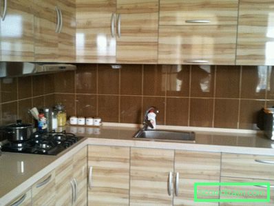
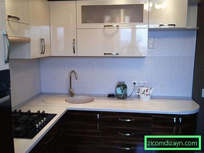
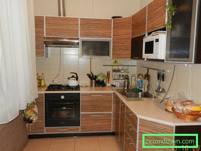
Zebrano kitchens in the interior (photo)
For those who appreciate original solutions and are not afraid to use them in their interior, an interesting option may be a Zebrano tree. It differs from the usual pine and oak tree with its amazing variegated texture, which to an ignorant person may seem even unreal, painted.

Zebrano looks very impressive in the kitchen - that's what we'll talk about today.
Basic rules of design of zebrano cuisine
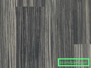
The word "zebrano" is not accidental: a tree in a cut really resembles a zebra in color, as thin fibers of dark and light colors alternate exactly like wool on the zebra skin.

Zebrano is convenient in processing, is not afraid of pests and, after appropriate processing, well tolerates high humidity and chemical reagents.
Thanks to such "makings", wood has become widely used in the production of furniture, so today you can buy both a kitchen made from natural zebrano, and simply lined with veneer "under the zebra" - both options have the right to life.
Consider the main rules that need to be guided by choosing a kitchen from zebrano.
Rule number 1. Zebrano should be in moderation. Even without painting and varnishing, this is a very bright material, and if you do everything from it - and a set, and a table, and a floor - then you will just have a ripple in your eyes when you go into the kitchen.
The golden rule of the ensemble works here: The main color should be found twice - in a larger element and in an additional detail. So, from zebrano you can order the kitchen set and, possibly, chairs. Or make a wooden "apron" and the floor, the kitchen itself leaving a single-colored, plastic, for example.
Rule number 2. Combining textures and materials, in addition to zebrano choose single-color surfaces. Variegated tiles with an abundance of details, for example, or funny wallpaper, which will be appropriate in another kitchen, will simply be lost here.
Zebrano fits well, with the right approach, with almost any colors, cold and warm, bright and pastel. This is its clear plus, due to the fact that the wood itself has already gathered in itself different shades.
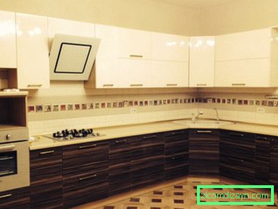
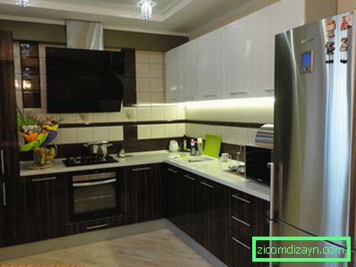
Rule number 3. Combine different types of zebrano in one kitchen. This is more of a tip, not a rule: you do not need to do this, but it will look very impressive.
For example, you can make the upper facade of the kitchen from a lighter tree, the lower one - from the dark, combining them with a neutral or, conversely, a contrasting "apron". You can assemble the kitchen in a checkerboard pattern, alternating deep and light shades of zebrano.
Rule number 4. Do not experiment with styles - Zebrano will look great in the design of high-tech, modern or minimalism, but, to put it mildly, inappropriate in the classical kitchen and even more so in the interior, "weighted" Victorian luxury.
This wood looks too exotic for such styles, so before buying a kitchen you need to think carefully about how the whole room will look. In addition to zebrano, you can safely add items from plastic, artificial or natural stone, glass.
Choose a shade
Varieties zebrano more than one would expect from an African tree, so choose the right one will have to carefully. Regardless of what you want to use the shade in the kitchen, remember two things:
- Each color should be in its place: sandy zebrano, for example, is practically not used for making countertops, and dark is rarely used for laying the floor.
- Be careful in choosing colors - any shade of zebrano fits well with a good dozen colors, but among them there are almost no "pure" colors: if red, then it's rather scarlet, if blue is cobalt, and so on.
Light Zebrano
It has a sapwood of warm golden or saturation-beige color with contrasting dark strips of different widths that are folded into a beautiful longitudinal pattern.

This zebrano is the most exotic, it reminds of an African sultry midday, so it is better to dilute it with pastel colors or, if you have a creative, energetic nature, shades of ocher and flowering poppy.
It looks very nice as a floor covering, but do not overdo it with the parquet pattern: narrow bars, often alternating, break the natural pattern of the material.
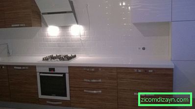
Sand Zebrano
The most neutral color that is suitable for those who do not like sharp transitions and contrasts. On a sandy, light beige background, bands of a slightly darker color are intertwined.

Sandy cuisine looks cute and fresh, especially in combination with light shades. From the sand zebrano is best to do the very facade of the kitchen and the work surface, on the floor it also looks good, as the strips smoothly flow one into the other, creating an even calm tone.
Gray Zebrano
Cold noble color, which looks very exquisite in the interiors of high-tech and modern. Zabolon light beige or gray, the stripes are also gray.
This "color" looks good on the floor, and in the very facade of the kitchen, giving it a fine beauty and purity, but not the sterility that is characteristic, for example, of white tiles.
It goes well with most cold shades, but just perfectly - with white and black, which causes the popularity of gray zebrano among minimalists in everything.
Kitchen in tempo zebrano
The tone consists of intermittent bands of medium and very dark tones, the color range can range from amber-golden to saturation-coffee.

This kitchen, even in combination with the most neutral colors, looks very bright and festive, so the dark zebrano enjoys great success today.
It can be combined with light shades of wood, but it should not be combined with gray zebrano. Perfectly "gets along" with almost the entire color range, ranging from black and white, and ending with red, blue and green.
How to combine zebrano in the kitchen with other flowers
White color. It looks good with a sandy Zebrano, ideally - with a dark, almost black. It is not recommended to perform the entire kitchen in white, enough to have a work surface, countertops, ceiling and individual elements.


Beige color. Almost all-purpose beige goes well with any shade of zebrano, but you should avoid tandems, in which the color of the wood itself is also beige: a small contrast should be present all the same. Zebrano + beige = a win-win option for those who want to see the kitchen an oasis of coziness and peace, where nothing cuts the eye and does not freak out.
Green color. Perfectly combined with zebrano, however with a reservation. It is better to pick an emerald green to a dark tree, to a sandy one - grassy, to a light one - dark green, and a gray zebrano is best combined with a marsh or jade tint. Such "arboreal" herbs create an atmosphere of wild nature, while simultaneously calming and toning.


Grey colour. Rarely used in such an exotic setting as the interior of the zebra. It looks best in the interior with gray zebrano, but in limited quantities. It is good in details, but on the big areas it is better to avoid a pure gray shade.


Orange color. The pure, "undiluted" orange is good near the golden and chocolate dark zebrano, however, if you have a light wood kitchen, it is better to use a darker shade closer to the crimson. This combination is suitable for active people who are oppressed by boring pastel colors.

Black color. A classic with which you need to be careful. Black exquisitely and stylishly looks with most varieties of zebrano, but it's important not to overdo it.
Black can be the "lower" facade or table, the working surface, individual elements - otherwise the kitchen will look like a dense cannibal's lair.


Fantasize, plan, think, and everything will turn out. Good luck!
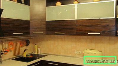
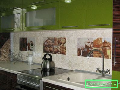
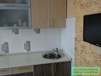
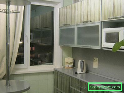
Zebrano Kitchens real photos